Are you interested in one of the datasets on the OpenJustice CA portal, but you want visualize it differently from their default? This is a walkthrough of how two hackers at the National Day of Civic Hacking identified a deficiency [TKTK awkward wording] in one of the OpenJustice visualizations, and adapted a visualization of some other dataset to the OpenJustice data.
This is the OpenJustice visualization that @saikirandulla and @aprilw were looking at:
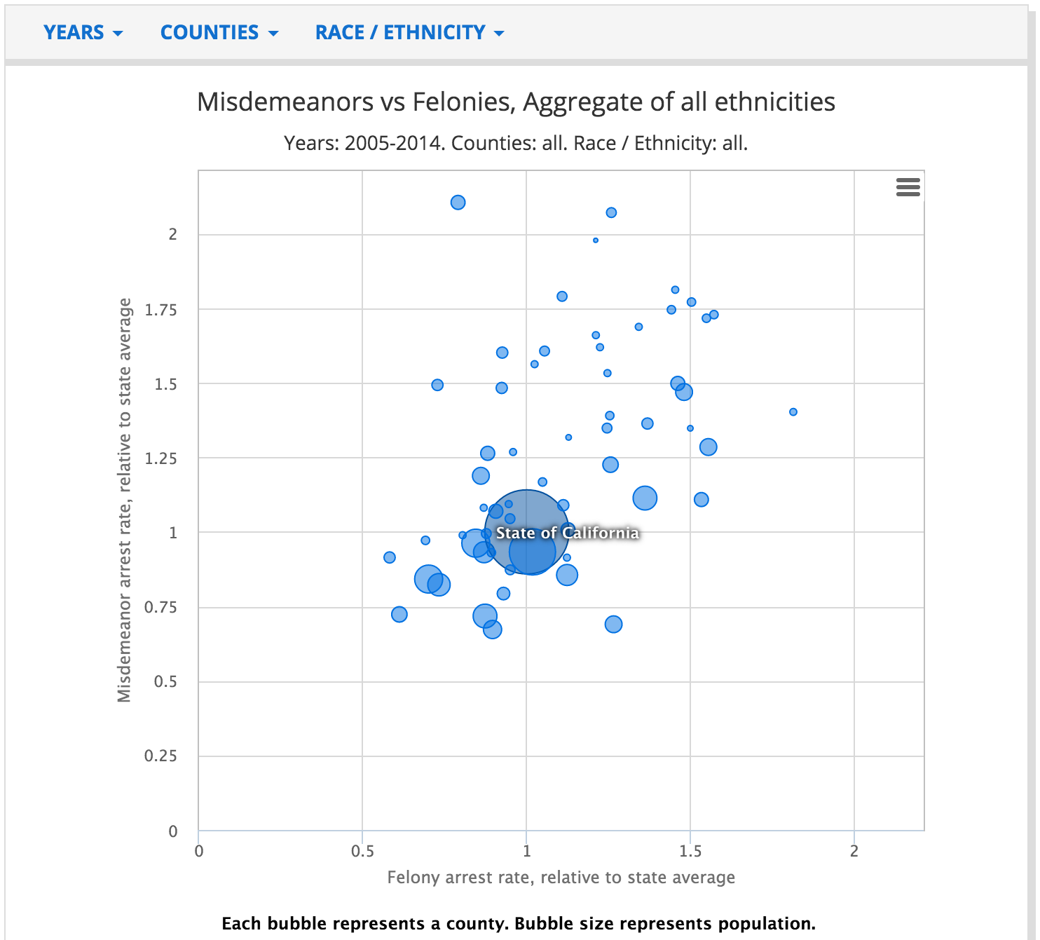
It plots the rates of misdemeanor vs felony arrests by county, providing a notion of the spread. They wondered, how has that changed over time? Well, you can filter by year:
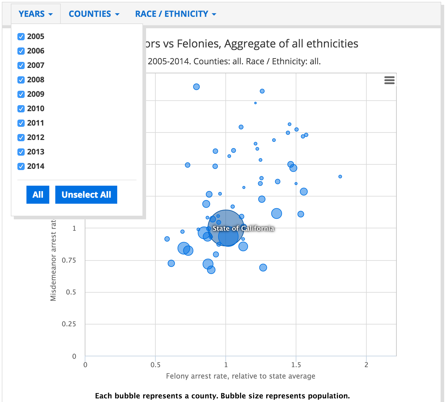
Okay…that provides the information we want, yet completely obscures the information we want. How can we see how these ratios have trended over time?
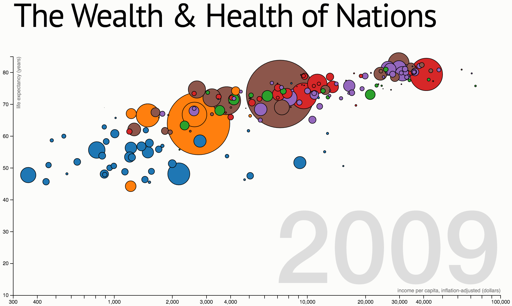
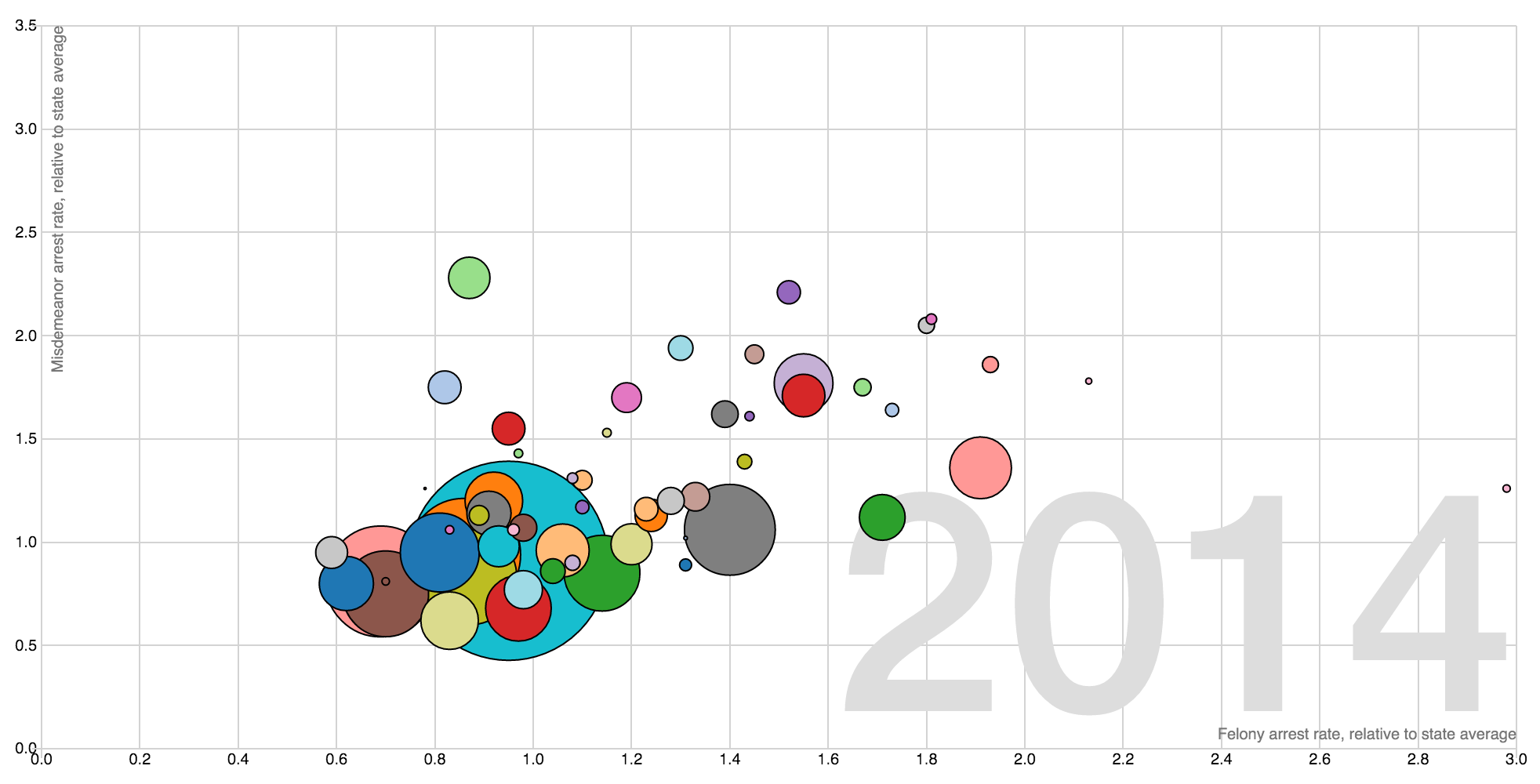
The interactive animation “The Wealth & Health of Nations” suggests one possibility: displaying on year at a time, and animating the time parameter:
TO BE CONTINUED
This will eventually be a walkthrough of the Misdemeanors vs Felonies visualization:
It was generated from Markdown, so that’s cool!